When it comes to the use of colors in marketing, make sure you’re sending out the right vibe.
When it comes to the use of colors in marketing, make sure you’re sending out the appropriate ‘vibe’. Color is a simple and complex concept. Imagine being a child and having access to the most basic box of Crayola crayons to draw with. We learn very early in life which color we associate with certain things simply by observing. Try to think of which color a child would choose if they didn’t have lots of shades to choose from—just the default shades of the primary—red, blue, and yellow—and secondary—green, orange, and purple—colors. A tree would be green, the sky would be blue, the sun would be yellow, and so on.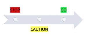
Consider a traffic light—something we all see every day. We STOP for red, use CAUTION for yellow, and GO for green. So, red catches attention the most; it’s the boldest. Green is the least mentally obstructive. And yellow represents caution—thoughtfulness and hesitancy. Which ideas do you think are worth conveying with regards to your brand’s/company’s goals?
Often overlooked, color plays a big role in effective marketing because of how consistently people associate certain colors with certain ideas. There are no hard and fast rules when it comes to colors, but our brains are conditioned to associate specific feelings with specific colors. To market your business most effectively, think of what feelings you want your website and your products to evoke in your customers.
Red
Tip: Use red to energize a passionate audience.
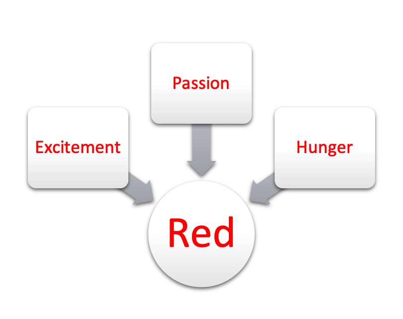
Red is associated with excitement, passion, aggression, and even food. It is one of the most provocative colors on the spectrum and could be worth using in your marketing if what you’re selling evokes strong feelings or high energy. Be aware though – some shades of red convey the feelings of ‘danger’.
Orange
Tip: Use orange for an audience that children are part of.
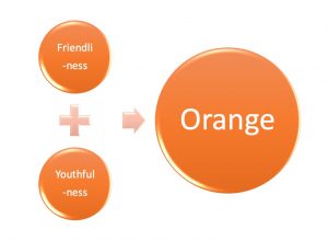
Orange is associated with friendliness and youth. It’s a jovial color and using it in marketing aimed at children or for products with children in mind could draw in the audience you’re looking for.
 Yellow
Tip: Use yellow to make an audience happy (or to make an audience cautious).
Yellow evokes warmth and evokes caution. Why? It may be because we see yellow in the sun, but we also see yellow in the center of traffic lights and on the background of ‘yield’ signs. Don’t hesitate to use yellow in your marketing if you’re worried about it evoking the wrong feelings—but be aware of its double association and make your marketing as inviting and happy as you can to boast that warmer side of the color as opposed to the more cautious side.
Green
Tip: Use green to catch the eye of an audience who appreciates health and freshness or to connect your audience with nature.
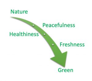 Green leans toward the cooler end of the spectrum, and its associations are more with nature and peacefulness. Many companies use green in marketing that promotes healthiness and freshness—so even though red is often associated with hunger and food, green is going to be more effective for the marketing of specific foods—such as organic foods.
Blue
Tip: Use blue to target a sophisticated audience or an audience that you want to feel comfortable using your services/product(s).
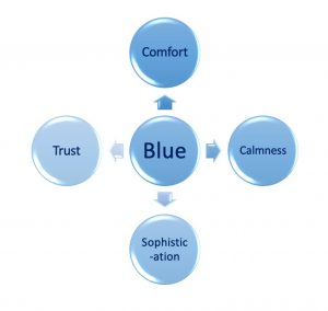
Blue is an extremely functional color because it evokes feelings of trust, calmness, and seriousness. Furthermore, much of what is associated with the color blue (the sky and the ocean) is vast and calming to many.
Purple
Tip: Use purple to inspire creativity.
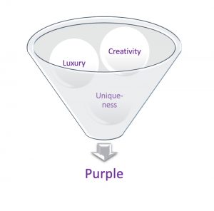
Purple is used primarily to evoke feelings of creativity, but it has historical roots in luxury and some people still associate purple with luxury. Purple is not as common as some other colors in marketing, however, so its use suggests feelings of creativity and uniqueness that could catch the eye of a variety of audiences.
There are of course more colors than the six written about above, but most other colors are more niche in their uses.
White
Tip: Use white for a calm and clean aesthetic—but be sure to consider other color(s) it is paired it with.
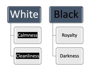
White is used to evoke calmness and cleanliness, but it usually needs another color with it to be truly functional. For example, marketing with an emphasis on only the color white isn’t going to be functional enough because whatever background the white is on is the actual color that is going to have an impact on those to whom you’re marketing.
Black
Tip: Use black for a luxurious or sophisticated aesthetic—but consider what other color(s) it is paired with.
Black is similar to purple in its associations with royalty/luxury, but black is also associated with darkness. Black could show some calmness or sophistication like the color blue, but like white, it may not be bold enough to evoke the kinds of feelings other colors might.
Brown & Pink
Tip: Use brown to target a masculine audience; use pink to target a feminine audience.
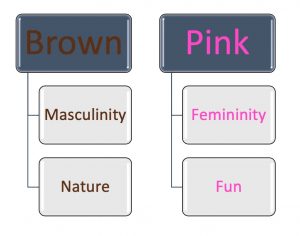
Brown and pink are also niche because they’re very masculinized and feminized, respectively. This isn’t to say brown and pink don’t have other uses (they do; brown is associated with nature like green is and pink is associated with warmth and fun like yellow and orange), but it’s rare to see these colors in marketing that isn’t aimed at a masculine audience or a feminine audience, respectively. If your goal is to draw in a wider audience than just a masculine one or just a feminine one, you may want to consider working with colors other than brown or pink.
Final Tip
Use the color you most associate with your brand as often as you can (the sooner your audience associates a certain color with your brand/company the better) and remember that while neutral colors like white/black/gray can always be complimentary, cooler colors (green/blue/purple) stand out amongst a warm color palette (red/orange/yellow)—and vice-versa.
Ultimately, there is no wrong use of color because what colors mean on a person-to-person basis is interpretive. For example, while red is psychologically held to evoke feelings of passion and energy, those feelings won’t be inspired in every individual that sees the color. Try to straddle the line of creativity and common sense when it comes to color selection in your marketing efforts.
Joe built his first website in 2003. Way back then, he moved his Real Estate company into email marketing and then social media marketing on MySpace – yes, you read that right – MySpace. Since then, he’s stayed immersed with all digital marketing channels and is a guru at ‘all things Google.’ Analytics, SEO and simplifying/optimizing complex sales funnels are his passions in the digital world, while his daughter, fishing, and various non-profits rule his free time.

