

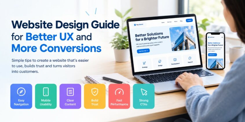
A website should do more than look attractive. It should help visitors quickly understand what a business offers, find the information they need, and take the next step with confidence. Good website design connects visual appeal with usability, clear content, simple navigation, mobile performance, and strong calls to action.
When these elements work together, visitors are less likely to feel confused or frustrated. They can move through the site naturally and find useful information without unnecessary effort. This creates a smoother experience while also supporting actions such as contacting a business, requesting information, booking a service, or making a purchase.
Improving website design starts with understanding how visitors use a site and what may prevent them from taking action. 8 Waves Creative focuses on creating clear and user-friendly digital experiences where design supports both visitor needs and business goals.
A strong website should make important information easy to find, work smoothly across devices, load quickly, and communicate value within seconds. It should also guide visitors toward relevant actions without making every section feel like a sales pitch.
The following strategies can help create a website that is easier to use and more effective at turning visits into meaningful interactions.
Create A Clear And Simple Navigation Structure
Navigation is one of the first things visitors use to understand a website. If people cannot quickly find the right page, they may leave before learning what the business offers.
A simple navigation structure reduces unnecessary clicks and helps visitors move between important sections naturally. The menu should reflect the way people think about the business rather than simply listing every available page.
Keep the main navigation focused on the pages visitors are most likely to need.
- Use familiar labels: Choose terms that visitors immediately understand.
- Limit unnecessary menu items: Too many choices can make navigation harder.
- Organize related pages: Group similar services or information together.
- Make important pages easy to reach: Place high-value pages where visitors can find them quickly.
- Keep navigation consistent: Use the same structure throughout the website.
A clear menu also helps search engines understand the relationship between different pages and topics.
Make The First Screen Easy To Understand
The first section visitors see should quickly explain what the website is about. People should not have to scroll through several sections before understanding the business or its main offer.
A strong opening area usually includes clear headlines, a short supporting message, and an action that matches the visitor’s likely next step.
Avoid filling the first screen with too many competing messages. Give visitors one clear reason to continue exploring.
- Lead with the main value: Explain what visitors can gain from the business.
- Keep supporting text concise: Use short sentences that add useful context.
- Use one primary action: Make the preferred next step visually clear.
- Create visual focus: Give important elements enough space around them.
- Match the message to visitor intent: Address what people are likely looking for.
This approach helps visitors understand the page before they start exploring deeper content.
Improve Readability and Content Layout
Even useful content can be difficult to read when it is presented as large blocks of text. Website visitors often scan a page first before deciding whether to read it closely.
Good layout makes important information easier to notice. Headings, short paragraphs, lists, spacing, and visual hierarchy help visitors quickly identify the sections that matter to them.
Content should feel approachable rather than overwhelming, especially on service pages and informational resources.
- Use short paragraphs: Break complex ideas into smaller sections.
- Add descriptive subheadings: Help visitors scan for specific information.
- Highlight useful details: Make important information easy to notice.
- Use bullets selectively: Present related points in a quick-to-scan format.
- Maintain consistent spacing: Give each section room to breathe.
Clear content presentation can make a website feel simpler without removing useful information.
Design For Mobile Visitors First
Many people browse websites from smartphones, so the experience should not depend on a large desktop screen. A layout that works well on a computer can become difficult to use when viewed on a smaller device.
Mobile-friendly design should consider touch controls, readable text, responsive layouts, image sizes, and the placement of important actions.
A visitor should be able to navigate the website without constantly zooming, scrolling sideways, or trying to tap tiny buttons.
- Use responsive layouts: Let content adapt naturally to different screen sizes.
- Keep text readable: Avoid fonts and sizes that strain the eyes.
- Make buttons easy to tap: Give interactive elements enough space.
- Check forms on smaller screens: Keep fields simple and comfortable to complete.
- Test important pages on multiple devices: Look for problems before visitors encounter them.
A strong mobile experience can also support visitors who first discover a business through search and continue researching from their phones.
Build Trust Through Visual Consistency
Visitors often make quick judgments about whether a website feels trustworthy. Consistent design can help create a more professional and recognizable experience.
Colors, typography, imagery, buttons, spacing, and messaging should feel connected from one page to another. A visitor should not feel like they have moved to a completely different website when they open another section.
A website designer in the US can use these elements to create a consistent visual system that supports recognition and usability.
- Use a consistent color palette: Keep core colors predictable across pages.
- Choose complementary fonts: Avoid using too many unrelated typefaces.
- Keep buttons consistent: Similar actions should have a similar appearance.
- Use relevant imagery: Visuals should support the message rather than distract from it.
- Maintain consistent page patterns: Repeated structures make websites easier to understand.
Consistency does not mean every page needs to look identical. Instead, each page should feel like part of the same digital experience.
Strengthen Calls to Action
A visitor may understand a service and still leave because the next step is unclear. Calls to action help solve this problem by showing people what they can do next.
The action should match the visitor’s stage in the decision process. Someone researching a service may want more information, while someone ready to move forward may want to contact the business.
A strong website design company considers calls to action as part of the overall visitor journey rather than adding buttons randomly across a page.
- Use action-focused language: Tell visitors exactly what will happen next.
- Make important buttons visible: Do not hide key actions in crowded layouts.
- Match CTAs to intent: Give visitors an appropriate next step.
- Avoid excessive options: Too many competing actions can create hesitation.
- Repeat useful actions naturally: Long pages may need more than one relevant CTA.
The goal is to make the next step obvious without making the website feel overly promotional.
Improve Page Speed and Visual Performance
A visually impressive website can still create a poor experience if pages take too long to load. Visitors expect websites to respond quickly, especially when browsing from mobile devices or slower connections.
Large images, unnecessary scripts, excessive animations, and poorly optimized assets can affect loading performance. Good design should consider performance from the beginning rather than treating speed as a final technical task.
A web design agency in the US may consider performance alongside layout, branding, content, and functionality when planning a complete website experience.
- Optimize large images: Reduce file sizes while preserving useful visual quality.
- Avoid unnecessary animation: Motion should support the experience rather than slow it down.
- Remove unused elements: Keep pages focused on useful content and functionality.
- Monitor important page metrics: Review performance regularly instead of relying on appearance alone.
- Prioritize visible content: Make the content visitors need first available quickly.
Better performance can make navigation feel smoother and reduce unnecessary friction.
Use Social Proof Without Overloading the Page
Visitors often look for signs that a business is established and trusted before taking action. Social proof can provide useful context when it is relevant and presented clearly.
Reviews, testimonials, certifications, recognizable client relationships, awards, and other credible trust signals can help visitors feel more informed. However, these elements should support the page rather than dominate it.
Choose evidence that directly relates to what the visitor is considering.
- Show relevant testimonials: Feature feedback connected to the service or product.
- Keep claims specific: Clear details are more useful than vague praise.
- Place trust signals near decisions: Add supporting evidence where visitors may need reassurance.
- Use authentic visuals: Avoid imagery that feels unrelated or overly staged.
- Keep proof easy to understand: Visitors should quickly see why the information matters.
The right trust signals can answer concerns without forcing visitors to search through the website.
Create A Better E-Commerce Journey
For online stores, website design has an especially direct relationship with the buying experience. Visitors need to move smoothly from discovering a product to reviewing details, adding an item, and completing checkout.
Product pages should provide useful information without creating unnecessary distractions. Images, descriptions, product options, delivery information, reviews, and purchase actions should be organized logically.
For additional guidance on creating an online store, see our resources on how to develop an e-commerce website that drives sales.
- Make product information easy to scan: Help shoppers find essential details quickly.
- Use clear product imagery: Give visitors a useful view of what they are considering.
- Simplify product choices: Make sizes, colors, variations, and other options easy to understand.
- Reduce checkout friction: Keep the purchasing process focused and straightforward.
- Show useful reassurance: Include relevant information about shipping, returns, or support.
A well-planned shopping experience can help visitors move from research to action with fewer obstacles.
Make Forms Easier To Complete
Forms are often an important conversion point, but overly complicated forms can discourage visitors. Every additional field creates another step for someone who may already be deciding whether to contact the business.
Only request information that is genuinely needed at that stage. A shorter form can be more approachable, while additional information can be collected later when appropriate.
- Ask only essential questions: Remove fields that do not support the immediate purpose.
- Use clear field labels: Visitors should understand what information belongs in each box.
- Explain required details: Avoid making visitors guess what they must provide.
- Show useful confirmation messages: Tell people when their submission has been received.
- Make forms mobile-friendly: Ensure fields and buttons work comfortably on smaller screens.
The easier a form feels, the less effort visitors need to invest before starting a conversation.
Improve Accessibility and Inclusive Usability
A website should be usable by as many people as possible. Accessibility considerations can improve the experience for visitors with different abilities, devices, and browsing preferences.
Readable text, logical heading structures, sufficient contrast, descriptive alternative text, keyboard-friendly interactions, and clear form labels are examples of areas worth reviewing.
Accessibility is not simply a technical checkbox. It can also make websites easier for everyone to navigate and understand.
- Use meaningful headings: Give pages a logical structure.
- Provide useful alternative text: Describe important images appropriately.
- Maintain readable contrast: Make text distinguishable from its background.
- Support keyboard navigation: Interactive features should not depend entirely on a mouse.
- Write clear instructions: Avoid unnecessary complexity in important interactions.
Small improvements can remove barriers and make the overall experience more comfortable.
Test What Visitors Actually Do
Design decisions should not rely entirely on assumptions. Website analytics, user behavior, feedback, and testing can reveal where visitors experience problems.
Look for pages with unusually high exits, forms that receive few submissions, confusing navigation paths, or important pages that receive little engagement. These signals can help identify areas that deserve closer attention.
Testing also makes website improvement an ongoing process rather than a one-time redesign project.
- Review user behavior: Look for patterns in how visitors move through pages.
- Check conversion paths: Identify where people stop before completing an action.
- Test important changes: Compare different approaches when useful.
- Collect visitor feedback: Ask real users where they experience difficulty.
- Improve gradually: Prioritize changes based on their potential impact and relevance.
The goal is not to change everything at once. It is to identify friction and make the experience progressively easier.
Balance Design with Business Goals
Good design should support what visitors need while also supporting the purpose of the website. A service business may want more inquiries, an online store may focus on completed purchases, and an informational website may aim to increase engagement with useful resources.
This means every major design element should have a reason for being there. Attractive visuals are valuable, but they should not make essential information harder to find.
A balanced website connects design, content, usability, trust, and action into one experience.
| Website Element | Visitor Need | Business Benefit |
| Navigation | Find information quickly | Supports deeper engagement |
| Page content | Understand the offer | Builds relevance |
| Calls to action | Know what to do next | Encourages interaction |
| Trust signals | Feel more informed | Supports decision-making |
| Mobile layout | Browse comfortably | Reaches more visitors |
| Page speed | Access information quickly | Reduces unnecessary friction |
When these elements work together, the website becomes easier to use while remaining focused on its wider purpose.
Common Website Design Mistakes to Avoid
Some design problems are easy to overlook because they may appear minor individually. However, several small issues can combine to create a frustrating experience.
Review the website from the perspective of someone who has never visited it before. This can reveal confusing labels, unclear messages, distracting elements, and unnecessary steps.
- Too much information above the fold: Give visitors a clear starting point instead of presenting everything immediately.
- Unclear buttons: Make actions specific enough for visitors to understand.
- Inconsistent page design: Keep visual and structural patterns connected.
- Overuse of pop-ups: Avoid interrupting visitors before they understand the page.
- Weak mobile layouts: Test important interactions on smaller screens.
- Hidden contact options: Make relevant ways to connect easy to locate.
Removing friction is often just as important as adding new design features.
How To Improve Website Design Over Time
Website improvement does not have to mean completely rebuilding the site. In many cases, focused changes can make important pages easier to use.
Start with the areas that directly affect visitors’ understanding and action. Review the homepage, navigation, service pages, contact forms, mobile experience, and key conversion paths.
A practical improvement process can include these steps:
- Review the current experience: Visit important pages as a first-time visitor.
- Identify friction points: Note confusing sections, slow pages, and unclear actions.
- Prioritize important pages: Start with pages connected to key visitor journeys.
- Improve content and layout: Make information easier to scan and understand.
- Test the updated experience: Check usability across devices and browsers.
- Monitor results: Use relevant website data to identify further improvements.
This process creates a practical path toward a website that becomes more useful over time.
Create A Website Experience Visitors Want to Use
Improving website design is not simply about making pages look better. It is about helping visitors understand information, navigate comfortably, trust what they see, and take the next step without unnecessary obstacles.
Start with the fundamentals: clear navigation, readable content, mobile usability, fast performance, consistent visuals, useful trust signals, and relevant calls to action. Then use visitor behavior and ongoing testing to identify where further improvements can make the experience easier.
A website that respects visitors’ time and needs can create a stronger connection while supporting meaningful business actions. Contact us today to discuss how thoughtful design improvements can help create a clearer, more user-friendly website experience for your audience.
With the right combination of usability, content, visual structure, and ongoing refinement, your website can become a more helpful destination for visitors and a stronger part of your digital strategy. 8 Waves Creative can help bring these elements together through a website experience built around clarity, usability, and meaningful visitor actions.
Frequently Asked Questions
How can I make my website easier to use?
Start by simplifying navigation, improving readability, making important actions clear, reducing unnecessary form fields, and checking how the site works on mobile devices. Testing the website with real users can also reveal problems that are easy to miss internally.
Why are website visitors leaving without converting?
Visitors may leave because they cannot quickly understand the offer, find the right information, trust the business, or identify the next step. Slow loading, confusing navigation, poor mobile usability, and complicated forms can also create friction.
How important is website speed for user experience?
Page speed affects how quickly visitors can access content and interact with a website. Improving images, scripts, page structure, and other technical elements can help create a smoother browsing experience.
Should a website have a chatbot?
A chatbot can be useful when visitors frequently need quick answers or help finding information. However, it should support the website experience rather than interrupt visitors or make it harder to reach a person when human assistance is needed.
How often should a website be redesigned?
There is no universal redesign schedule. A website may need significant changes when its technology, content, branding, business goals, audience needs, or usability issues have changed. Regular reviews can help identify when updates are necessary.

As Senior Project Manager at 8Waves Creative, Sharon brings a strategic, organized approach to managing complex marketing initiatives. With extensive corporate marketing experience across a range of channels, she understands how the pieces fit together to create cohesive, effective campaigns. She keeps projects moving, teams aligned, and the details on track from start to finish.
Outside of work, Sharon enjoys spending time at the beach and cheering on her children from the sidelines.