


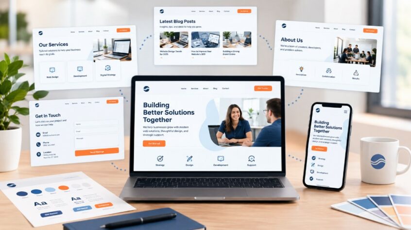
A website should feel like one connected experience rather than a collection of unrelated pages. Whether visitors arrive on your homepage, service page, blog, or contact page, they should recognize the same business through familiar visuals, messaging, tone, and design elements. This is where brand consistency becomes important. It brings together your colors, fonts, imagery, messaging, layouts, buttons, and overall visual style so visitors can quickly understand who you are, what you offer, and what makes your business different.
8 Waves Creative helps businesses create a more unified digital presence by bringing these elements together in a clear and purposeful website experience. Brand consistency does not mean every page needs to look exactly the same. Each page can have a different purpose and layout while still following the same visual identity and communication style. When these elements work together, visitors can move between pages without feeling like they have entered a completely different website.
A consistent website can also make information easier to understand and actions easier to follow. Familiar navigation, headings, buttons, colors, and content patterns help visitors know where they are and what to do next. By creating a connected experience across every page, businesses can make their websites easier to recognize, navigate, and remember.
Create Clear Brand Guidelines Before Designing Pages
Consistency becomes much easier when your team knows exactly what the brand should look and sound like. Without clear guidelines, different pages may slowly develop their own styles, especially when several people create or update website content.
A simple set of brand guidelines gives everyone a shared reference point. It does not need to be complicated or filled with design jargon. It simply needs to explain the basic rules that should remain consistent across the website.
Consider documenting these core elements:
- Brand colors: Define primary, secondary, and supporting colors for different website elements.
- Typography: Identify the fonts, sizes, weights, and styles used for headings and body text.
- Voice and tone: Explain whether your communication should feel friendly, professional, direct, educational, or conversational.
- Logo usage: Establish where the logo appears and how much clear space it needs.
- Imagery: Set expectations for photography, illustrations, icons, graphics, and other visual assets.
- Button styles: Keep calls to action visually recognizable throughout the website.
- Writing style: Use consistent wording, sentence structure, capitalization, and terminology.
These guidelines become especially useful when your website grows. New pages can be created using the same foundation instead of starting the design process from scratch each time.
Keep Your Visual Identity Connected
Visual consistency is one of the fastest ways for visitors to recognize a brand. Even when someone enters your website through a blog post or service page, the page should still feel connected to the rest of the site.
This does not mean every page needs the exact same layout. Different pages have different purposes, so their structures can change. The important part is maintaining familiar visual patterns that make the website feel unified.
Pay attention to the following areas:
- Color combinations: Use a controlled color palette instead of introducing unrelated colors on individual pages.
- Font hierarchy: Keep heading and paragraph styles predictable so visitors can scan content easily.
- Image treatment: Use similar image styles, proportions, and visual quality across related pages.
- Icon design: Avoid mixing completely different icon styles unless there is a clear reason.
- Spacing: Maintain similar spacing patterns between headings, paragraphs, images, and sections.
- Navigation elements: Keep menus, headers, footers, and other recurring components consistent.
- Call-to-action design: Use recognizable button shapes, colors, and wording patterns throughout the site.
A visitor should not have to wonder whether they are still on the same website after clicking a link. Consistent visual signals create familiarity and make navigation feel more natural.
Align Website Messaging with Your Brand
A visually consistent website can still feel disconnected if the words change dramatically from page to page. Messaging should support the same identity as the visual design.
Your homepage may introduce the business in a broad way, while a service page may explain a specific offering. A blog may provide educational information. Even though these pages have different purposes, they should communicate from the same brand perspective.
This is where content and design need to work together. A polished web and design service should consider both how a page looks and how its message supports the larger brand experience.
Review your website for consistency in areas such as:
- Value proposition: Make sure your main customer benefit is clear across important pages.
- Service descriptions: Use consistent names and explanations for your core services.
- Tone: Avoid switching from conversational language on one page to overly formal language on another.
- Calls to action: Give visitors clear next steps that match their stage in the buying journey.
- Key terminology: Use the same terms when referring to your products, services, processes, and audiences.
- Brand promise: Make sure important claims remain accurate and consistent across the site.
A useful test is to read several pages from different parts of the website without looking at the navigation. Ask whether they sound like they were written by the same business. If the answer is no, your messaging may need to be refined.
Make Navigation Feel Familiar Everywhere
Navigation plays a major role in how people experience a website. When menus and important navigation elements change from one page to another, visitors may become confused about where they are or where they should go next.
A consistent navigation structure creates a sense of familiarity. Visitors learn where to find key information and can move between pages with less effort.
Your navigation should generally provide:
- Consistent menu placement: Keep primary navigation in a familiar location throughout the website.
- Clear labels: Use straightforward terms that accurately describe each destination.
- Logical page relationships: Group related services, resources, and information in a way that makes sense.
- Consistent footer links: Give visitors another dependable way to find important pages.
- Visible calls to action: Make important actions easy to locate without overwhelming the page.
Navigation consistency is particularly important for larger websites with many service pages and educational resources. A predictable structure helps both visitors and search systems understand how different parts of the website relate to one another.
Use Consistent Page Components
Reusable website components can make consistency easier to maintain as your website grows. Instead of designing every section independently, create common patterns that can be adapted to different content.
For example, service pages might use a similar structure while changing the copy, images, and specific information. Blog pages can follow another established pattern while maintaining the same visual language.
A website design company serving businesses in the US should consider reusable components as part of a scalable website strategy. Common components may include:
- Header sections: Keep the main branding and navigation structure familiar.
- Hero areas: Maintain consistent relationships between headings, supporting copy, images, and actions.
- Content sections: Use repeatable spacing and layout patterns for easier scanning.
- Testimonial blocks: Present customer feedback using a recognizable design.
- Service cards: Keep card layouts, headings, imagery, and action elements consistent.
- Contact sections: Make contact information and conversion options easy to recognize.
- Footer areas: Maintain the same core links and brand elements across pages.
Reusable components also make future updates easier. When a design pattern needs improvement, updating the shared component can help maintain a consistent experience across multiple pages.
Connect Branding with Content Design
Branding should not sit separately from the content on your website. The design should help visitors understand and remember the information they are reading.
For example, a professional service business may benefit from clean layouts, straightforward language, strong hierarchy, and photography that communicate expertise. A creative business may use more expressive visuals while still maintaining consistent typography, colors, and messaging.
If you want to explore the relationship between branding and website design in more detail, read this guide on incorporating branding into website design.
The strongest results usually come from treating content and design as connected parts of the same experience. Consider how each page communicates through both words and visuals.
- Match visuals to the message: Choose images and graphics that support what the page is saying.
- Use hierarchy to guide attention: Make the most important information visually clear.
- Keep layouts easy to scan: Break long content into useful sections and short paragraphs.
- Support actions visually: Make important next steps noticeable without being distracting.
This approach helps the website feel intentional instead of assembled from separate design decisions.
Review Every Page During Regular Brand Audits
Brand consistency can slowly decline as websites change. New pages are added, old content is updated, new images are uploaded, and different people contribute to the site. Regular reviews help catch these inconsistencies before they become noticeable problems.
A brand audit does not have to involve rebuilding the website. Start by reviewing your most important pages and comparing them with your established guidelines.
Look for issues such as:
- Different fonts: Check whether pages are using approved typography.
- Outdated colors: Remove colors that no longer fit the current visual identity.
- Inconsistent terminology: Standardize names for services and key offerings.
- Old messaging: Update outdated descriptions and brand statements.
- Different button styles: Replace variations that do not match the main design system.
- Mismatched imagery: Remove visuals that feel unrelated to the overall brand.
- Uneven page layouts: Identify pages that look noticeably different without a clear purpose.
A regular review can also reveal opportunities to improve the user experience. A page may technically match the brand but still be difficult to read, navigate, or use.
Make Mobile Experience Part of the Brand
Your website needs to communicate the same identity on phones, tablets, and desktop screens. A page that looks polished on a large screen can feel very different when viewed on a smaller device.
Mobile consistency involves more than shrinking desktop content. Menus, buttons, images, typography, spacing, and content order should all work comfortably across screen sizes.
A reliable mobile experience should include:
- Readable text: Keep font sizes comfortable for smaller screens.
- Easy-to-use buttons: Make important actions simple to tap.
- Flexible images: Prevent images from becoming cropped or distorted.
- Simple navigation: Reduce unnecessary steps when users browse on mobile.
- Consistent branding: Preserve the same colors, fonts, imagery, and messaging.
- Comfortable spacing: Give interactive elements enough room to avoid accidental taps.
A consistent mobile experience reinforces the same brand impression regardless of how someone reaches your website.
Support Consistency with the Right Web Strategy
Brand consistency works best when it is considered during planning rather than added after pages have already been created. Your site structure, content plan, visual system, and conversion goals should work together.
A strong web design service can help turn these principles into practical page layouts, reusable components, responsive designs, and clear user journeys. The exact approach will depend on your business, audience, website size, and goals.
Before creating or redesigning pages, establish a clear foundation. Decide what your brand should communicate, how it should look, how it should sound, and what visitors should be encouraged to do.
Then use that foundation consistently while allowing individual pages enough flexibility to serve their specific purpose.
Common Brand Consistency Mistakes To Avoid
Even businesses with established branding can create inconsistencies without realizing it. Small differences may seem harmless individually, but several mismatched elements can make the overall website feel less polished.
Watch for these common issues:
- Using too many fonts: Limit typography choices to a small, purposeful system.
- Changing colors between pages: Keep your approved palette consistent across the site.
- Mixing communication styles: Make sure every page reflects the same general voice.
- Copying competitors: Build a recognizable identity instead of following another company’s presentation too closely.
- Overdesigning individual pages: Avoid making one page dramatically different without a clear reason.
- Ignoring older content: Review existing pages when your brand identity changes.
- Treating mobile as an afterthought: Make responsive design part of the initial process.
- Adding inconsistent calls to action: Use a clear approach to guide visitors toward useful next steps.
The goal is not perfection on every page it is about creating a website where differences feel intentional rather than accidental.
Build A Website That Feels Like One Complete Brand
Every page of your website contributes to the impression visitors form about your business. A consistent color palette, clear messaging, familiar navigation, connected visuals, and reliable page structure can make the entire experience easier to understand and remember.
8 Waves Creative can help businesses bring these elements together through thoughtful website planning and design. The key is to create a clear brand foundation first and then use it consistently across every part of the site.
If your website currently feels like different pages were created at different times, start with a simple audit. Identify the biggest visual, messaging, and navigation differences, then prioritize the changes that will create the most unified experience. Contact us today to explore how your website can better reflect a clear and recognizable brand across every page.
Frequently Asked Questions
Should every page on a website have the same design?
No. Pages can have different layouts based on their purpose, but they should share recognizable visual and messaging elements. This allows flexibility while maintaining a connected experience.
How can I check if my website branding is consistent?
Review your homepage, service pages, blog, landing pages, and contact page side by side. Compare colors, fonts, imagery, messaging, navigation, buttons, and spacing to identify noticeable differences.
What should be included in a website brand guide?
A useful guide can include logo rules, colors, fonts, image direction, writing tone, button styles, navigation patterns, spacing standards, and examples of common website components.
Can inconsistent branding hurt user trust?
Inconsistent presentation can make a business appear less organized or harder to understand. A clear and familiar website experience can make it easier for visitors to recognize the business and navigate its information.
How often should website branding be reviewed?
Review the website whenever there is a major rebrand, redesign, new service launch, or significant content update. A periodic review can also help identify smaller inconsistencies before they spread across new pages.

As Senior Project Manager at 8Waves Creative, Sharon brings a strategic, organized approach to managing complex marketing initiatives. With extensive corporate marketing experience across a range of channels, she understands how the pieces fit together to create cohesive, effective campaigns. She keeps projects moving, teams aligned, and the details on track from start to finish.
Outside of work, Sharon enjoys spending time at the beach and cheering on her children from the sidelines.